


The wealth of data organizations generate today, can make you giddy. Gaining insight thereout becomes at best challenging. The rescue comes from analytics dashboards, providing marketers and analysts with real-time results and value from the information you gather.
Dashboards, as collections of widgets that visualize data, not only offer you a swift glance at your website’s performance, but also act as an effective mechanism to share your insights on the fly.
They help you save time, track changes in your reports on the spot, keep you up to date with campaign metrics, and let you discover the source behind your KPIs’ value.
In today’s post, we’ll show you how you can employ Piwik PRO dashboards into your everyday practice to better organize your data and drive more meaningful action.
The essentials of effective analytics dashboards
Before we talk about building and taking advantage of all these reports, here are some golden rules you should consider as you start the creation process. These will help you overcome the challenge of excess data that simply lack context. That’s a common scenario among businesses, but we’ll show you the way out of it.
First, when creating a dashboard, think about who is going to use it and for what purpose. This way, it will be easier to select which widgets to add what data to display in the reports.
It will leave no room for misleading or wrong interpretations, which is the principle behind efficient dashboards — they should be clear, simple and concise.
Ensure your reports won’t overwhelm readers with too many details. You should focus on displaying only the key metrics, breaking down dashboards into smaller ones, and applying tabs to further segment your data.
Finally, make your dashboards visually appealing by underlining the crucial elements with some colors and choosing the most appropriate type of report to present information in the right way. Also, provide simple and specific chart titles and descriptions so viewers will quickly understand what you’re presenting.
If you’re curious how to apply dashboards to get the most out of them, take a look at:
Analytics Dashboards: Everything You Need to Know to Build Effective Dashboards
Creating Piwik PRO dashboards from A to Z
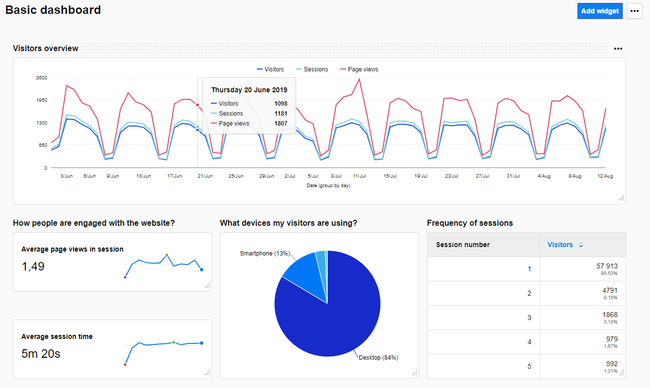
With the latest release Piwik PRO Analytics Suite 9.0, we’ve considerably enhanced the user experience of the dashboards. You’ll be able to get an overview of your business’s analytics metrics and all the important information in a concise and fast way.
Now, we’ll walk you through the key options available during the process of creating a single web analytics dashboard.
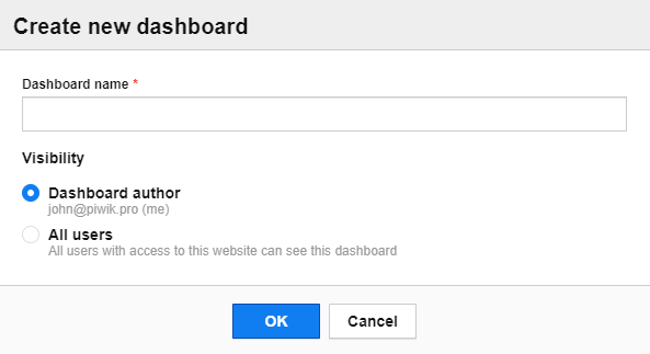
Set up access to your web analytics dashboard
When you create a new dashboard in Piwik PRO, you can choose who will get access to it. You can make it private or show it to all users who have access to a particular website. Just pick one of the visibility options.
Pick the right widget
As we’ve already mentioned, a dashboard is a set of reports, which are made up of widgets. They come in different shapes and sizes. What’s more, you can easily move them around to adjust the layout to your individual needs.
You can choose from the following types of reports:
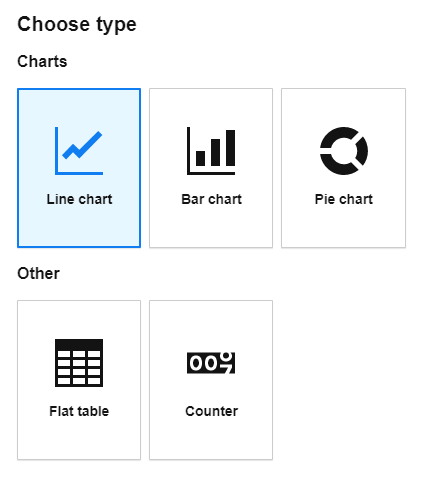
Each kind of widget fulfills a particular purpose to better show your data. When you need to visualize your metrics with numbers, choose Counter. To present data across time, go for Line or Bar chart, and use Pie chart to report reflecting percentages.
Finally, apply Table when you want to display dimensions and metrics.
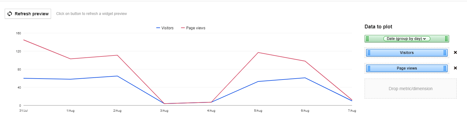
Create a Line chart report
Creating any custom report is quite straightforward. You just need to pick a dimension and metric you want to display and make sure that this particular combination works for you.
For example, if you combine one metric with large values and another one with small ones, it would be hard to draw any conclusions as the values for the second metric won’t even be visible.
The red line on the chart below illustrates such case.
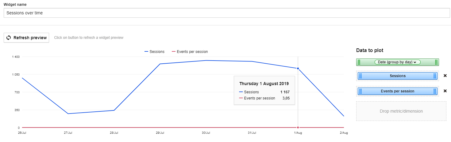
But when you apply metrics with a similar range of values, you will be able to get more actionable data:
Create a Table report
You can create a Table report when you want to juxtaposition several dimensions with one or two metrics in a clear way.
However, keep in mind that regardless of the setup, you still need to add some context. Otherwise, it will be hard to get an idea of what the numbers mean.
Let’s look at one such report.
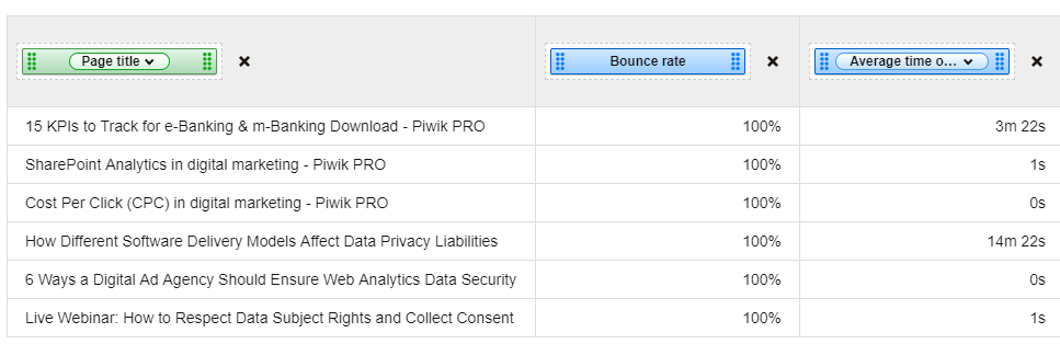
At first it seems correct and logical, but when you look closer it lacks page views. You don’t know whether the numbers apply to a single visit or one million visits, meaning your report is not reliable.
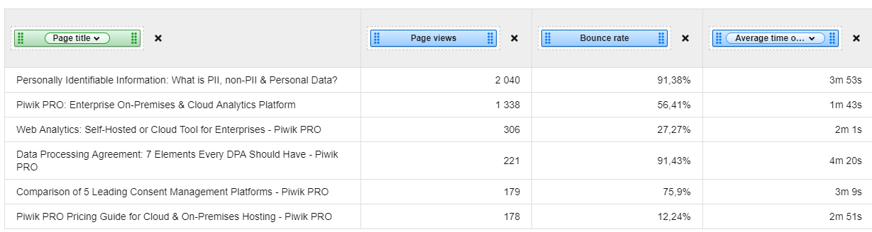
To fix this report, you need to add the page views metrics, and then you can start your analysis and draw conclusions.
Add a Counter widget
A Counter widget comes in handy when you want to quickly show the metric value. During the setup, you can decide which metric to show and whether to apply a full name and trend sparkline or not.
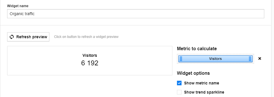
What’s more, you can apply some filters. For instance, you can create two separate widgets, one for all traffic visitors, the other for the number of visitors who came to your site via a search engine.
The comparison of 10 web and app analytics platforms
Compare the main features of Piwik PRO Enterprise, Google Analytics 4, Matomo Cloud, Adobe Analytics, AT Internet, Countly Enterprise, Mixpanel Enterprise, Amplitude Enterprise, Snowplow Enterprise, and Heap Premier.
Use filters in your reports
You can filter your report data by numerous criteria, depending on your particular needs. This helps you to narrow down the data you want to display.
You can use only dimensions, or just metrics, or a combination of both.
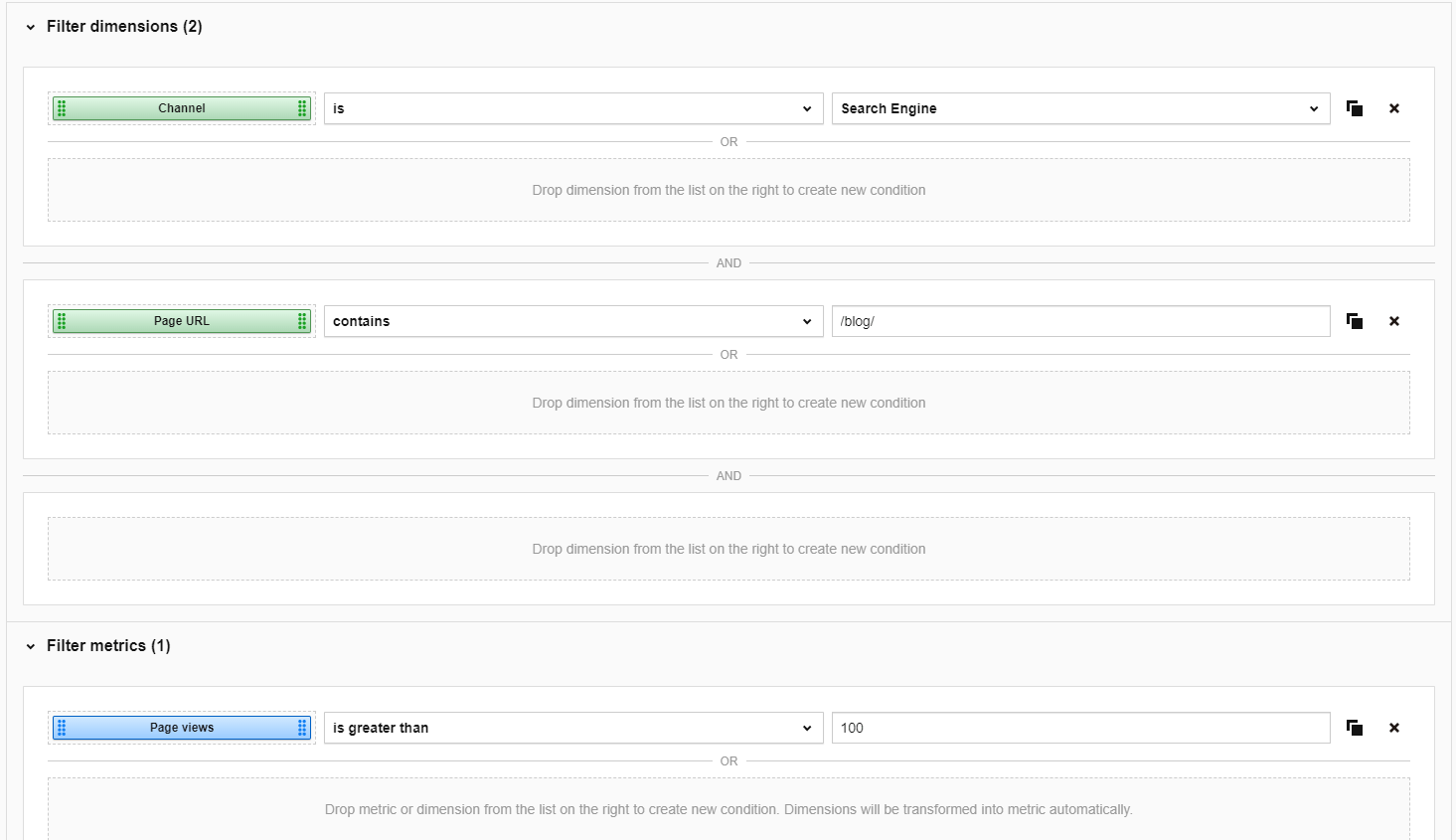
Here is an example of how to put filters into action for the Page URL report:
- Blog posts
- Organic visits
- Page views value is higher than 100
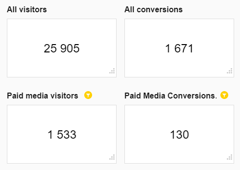
To provide some wider context to this report, you should use the same metrics but with different filters.
Let’s look at an example of traffic and conversions for paid media compared with all traffic:
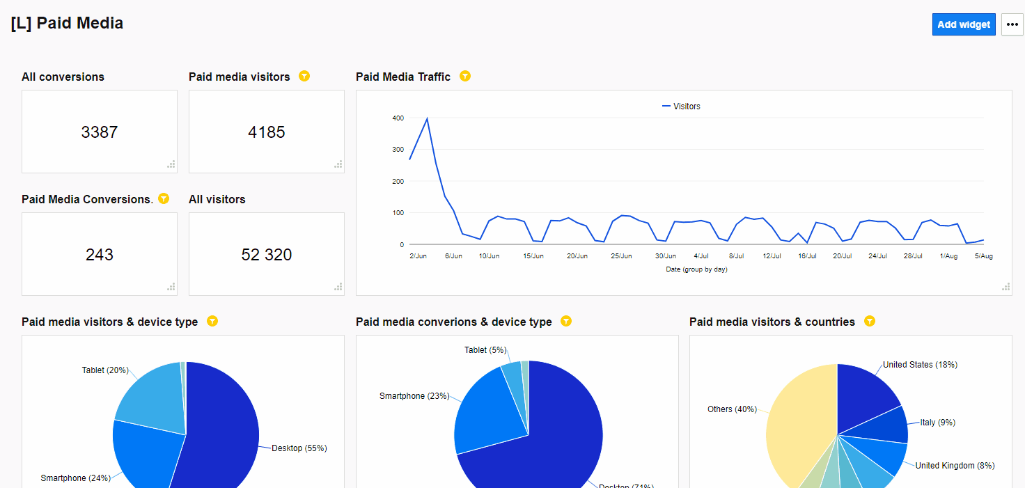
Play around with the dashboard layout
Creating analytics dashboards in Piwik PRO comes easy and offers you extra flexibility. With a drag-and-drop interface, you can move each widget around and also change its size.
You can create up to three widgets in one column for Charts and Tables, and up to six when you use Counters.
Take a look at this flexibility in action:
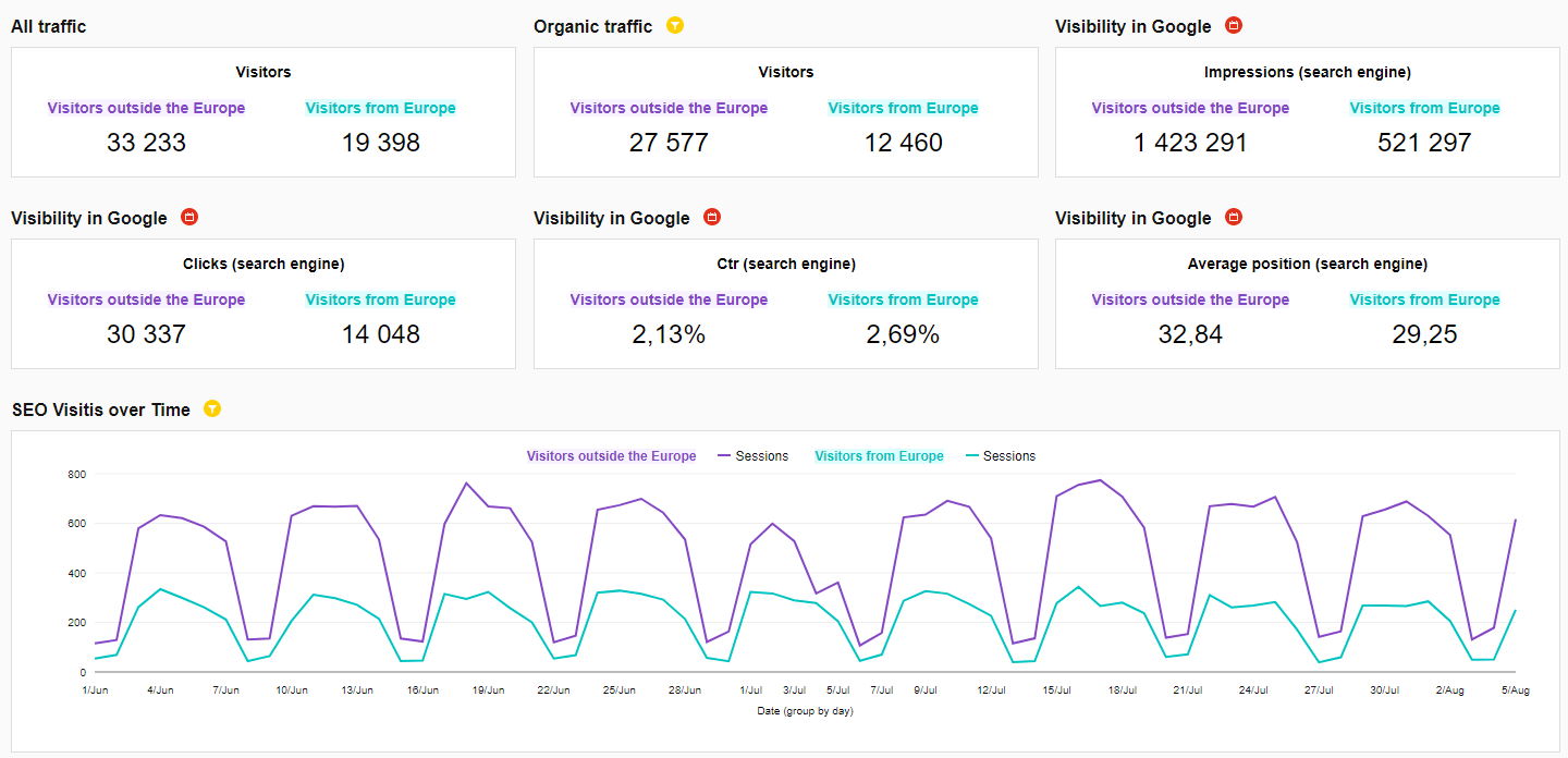
Segment your dashboard data
If you want to get deeper insights, you need to drill down your reports and display only the key information. That’s why you should apply segments to your dashboard.
Have a look at the ones created based on the visitors’ location data for people from and outside of Europe. You can duplicate each report for each segment to better see the differences between them.
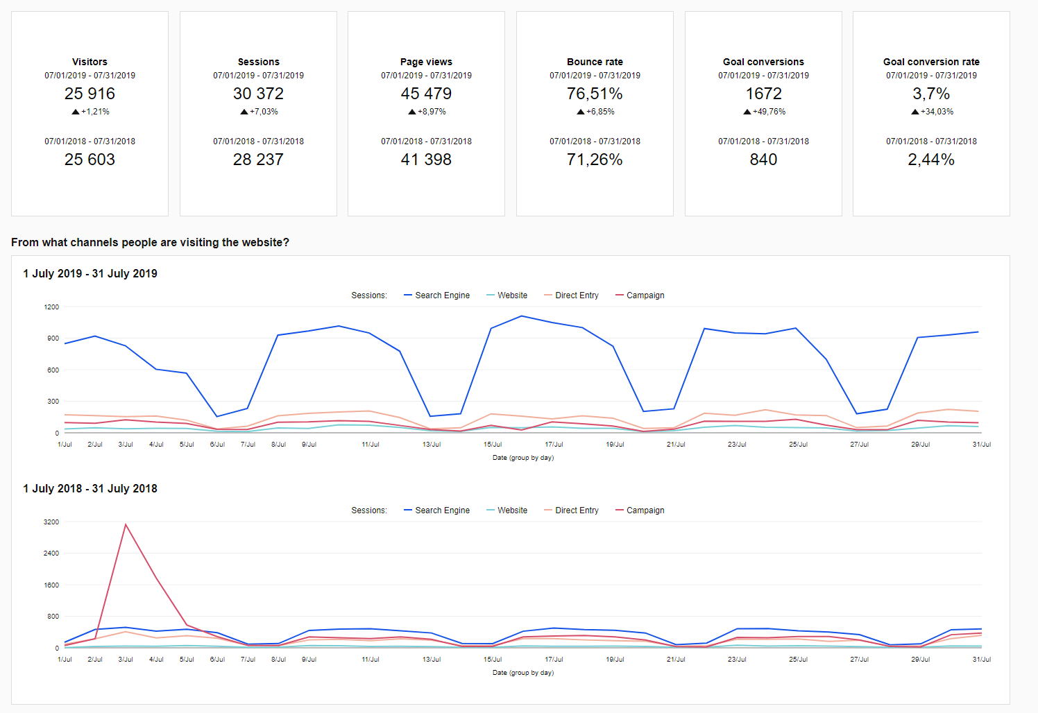
Make use of date range comparison
As we’ve already mentioned, numbers alone won’t be enough to get a better understanding of your website or app’s performance. One of the ways to add more details to the picture is to juxtaposition reports of different data ranges.
Check out the comparison of July 2019 and July 2018 to see the progress made within one year:
In case you want to learn more about the benefits of contrasting different time periods, check out:
How to Compare Segments and Data Ranges in Custom Reports for Better Analytics Insights
Get inspired with Piwik PRO Analytics dashboards
Once you’ve learned all the essential building blocks of effective dashboards, it’s time to put them together and see the ready-made examples.
Each report was designed to serve a particular purpose and meet a certain goal. We’ve included a wide variety of examples so you can find the one that will fit in your business profile. And you can use them as templates to create your own set of reports.
Pro tip: you can apply desired segments into the dashboards to provide more context to the data.
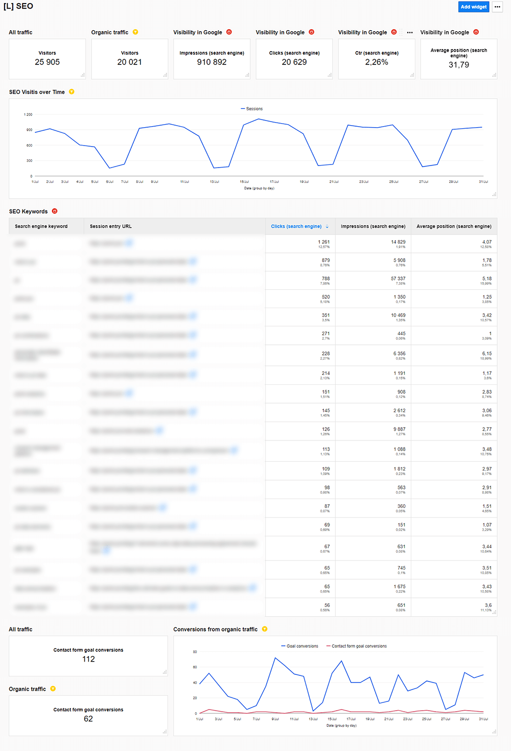
SEO dashboard
Carefully analyze your traffic from search engines. Monitor page visibility and take a look at the keywords that bring more traffic to your website.
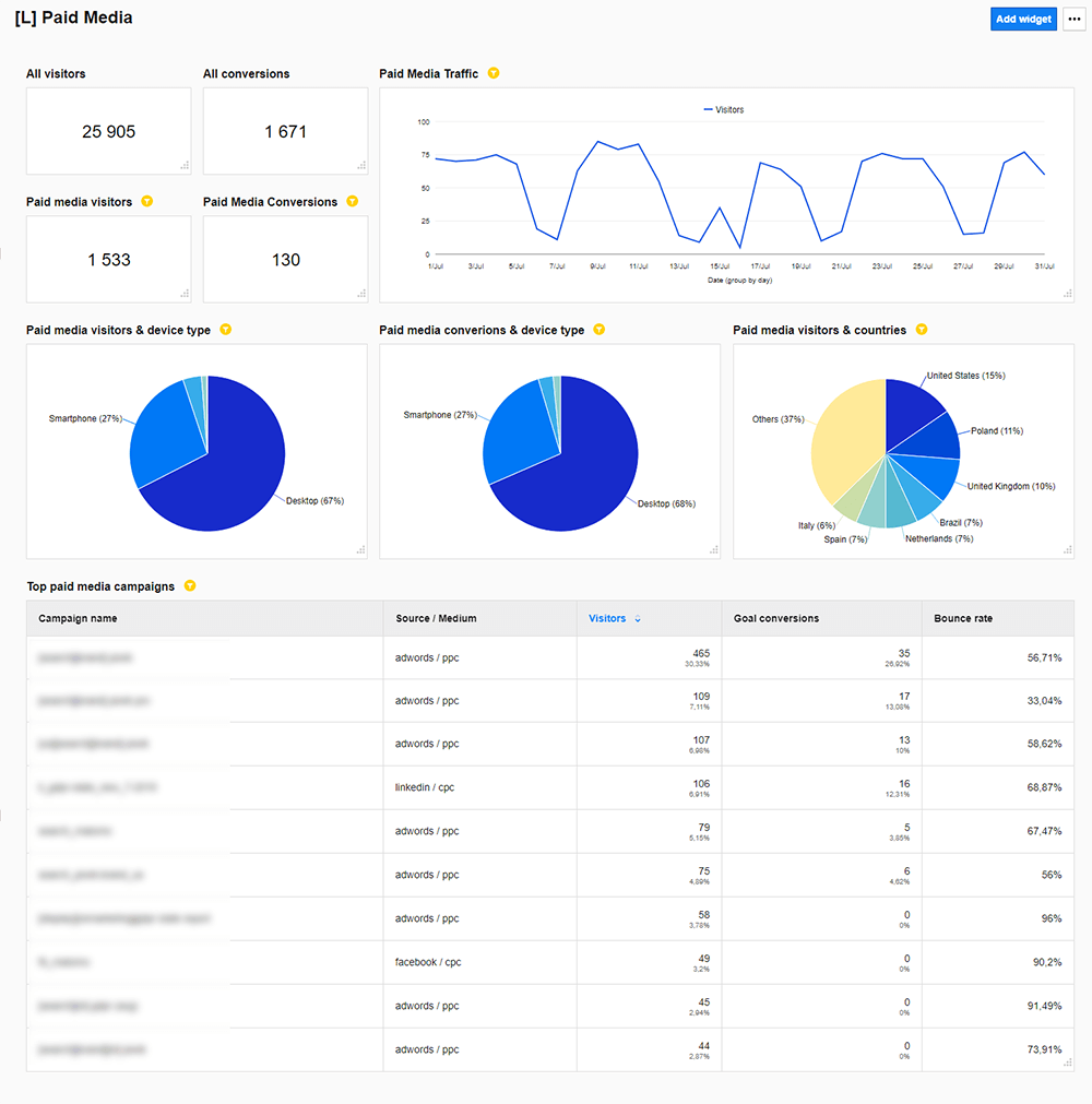
Paid media dashboard
Analyze the performance of your paid campaigns, be it in Google Ads, Facebook Ads, LinkedIn Ads or any other ones. Thanks to this dashboard, you can provide all stakeholders with basic metrics, traffic volume, number of conversions, as well as highlight which medium brings the best results and which one is creating a hole in your budget.
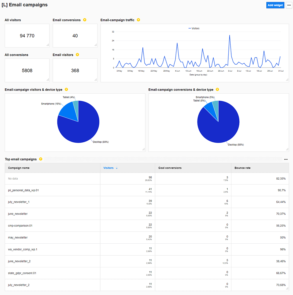
Email campaigns dashboard
Gather all information about your email campaigns in one place. Find out which one drives more traffic, which exact messages resonate with your readers, and what content you should review and improve. Also, you can have a look at all clicks, sends, and opens.
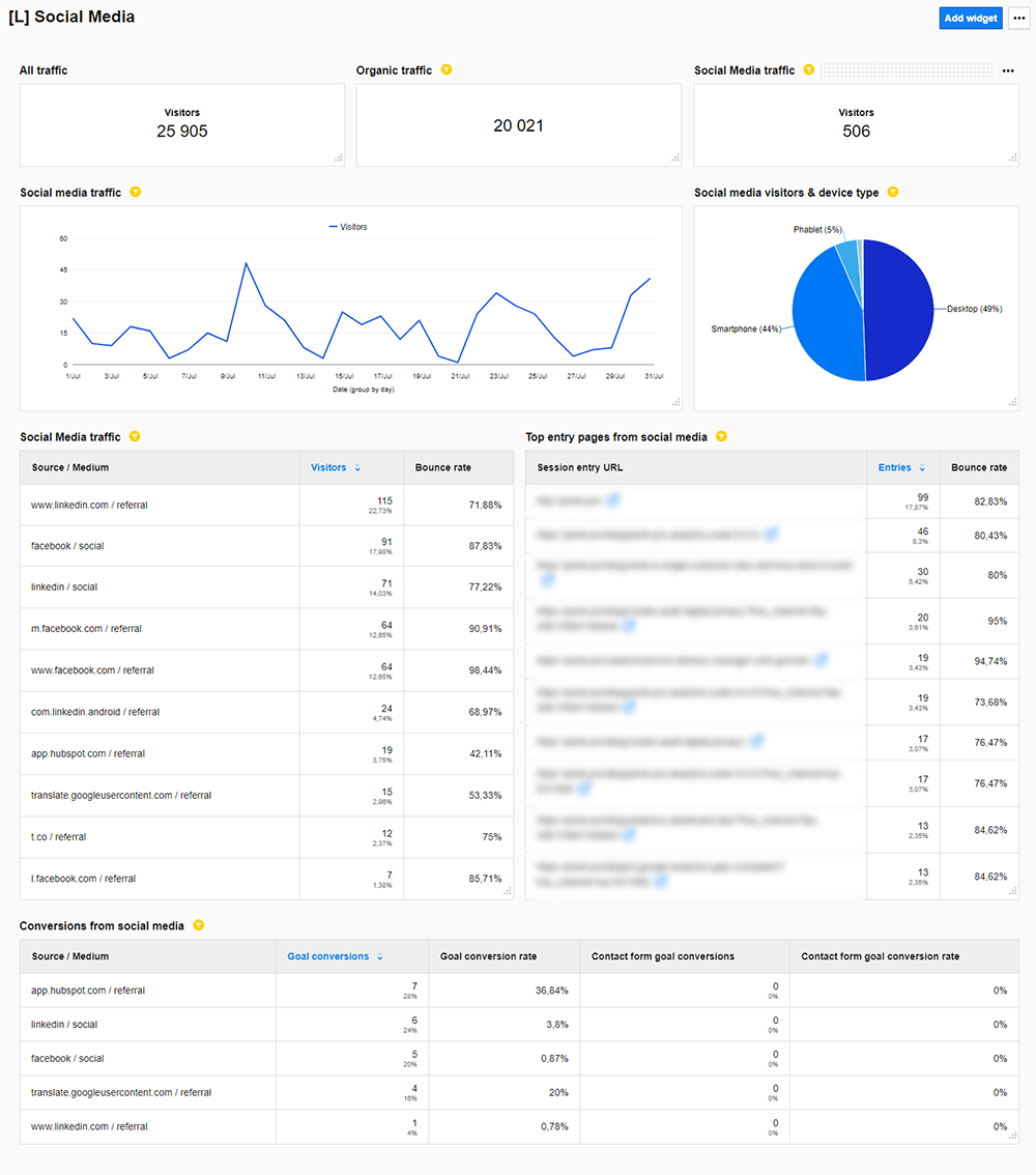
Social media dashboard
Examine and measure all metrics related to social media channels. Check out which platforms bring the most traffic to your website and which pages are the most viewed.
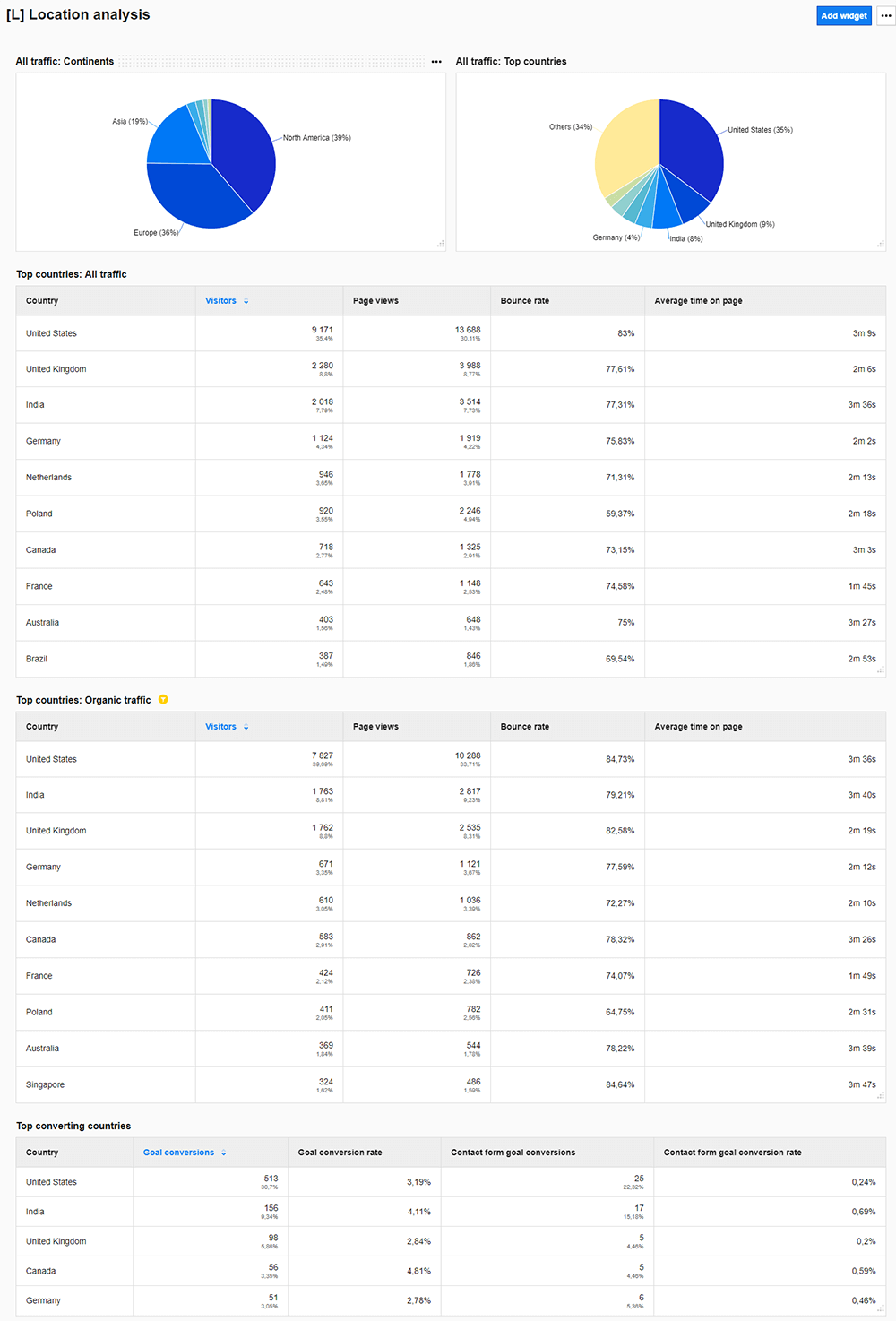
Location analysis dashboard
Split the traffic across countries and see which ones are driving the highest number of visits to your site. Study location data to see where the most active and engaged audience is and how it impacts your conversions.
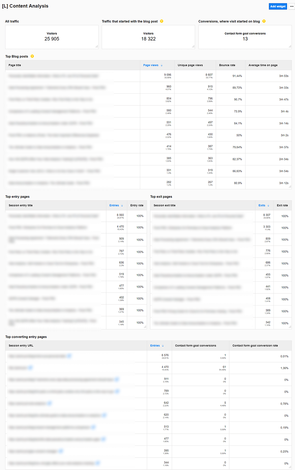
Content analysis dashboard
Take a deep dive into your website’s content. Verify which pages, posts, and materials spark the most interest among your visitors and find out what the user engagement metrics are. Discover what particular bits on your site propel conversions.
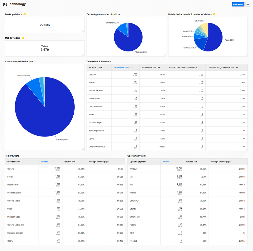
Technology dashboard
Report on the traffic from different devices, browsers or operating systems. Find any problems that can occur on different platforms or software.
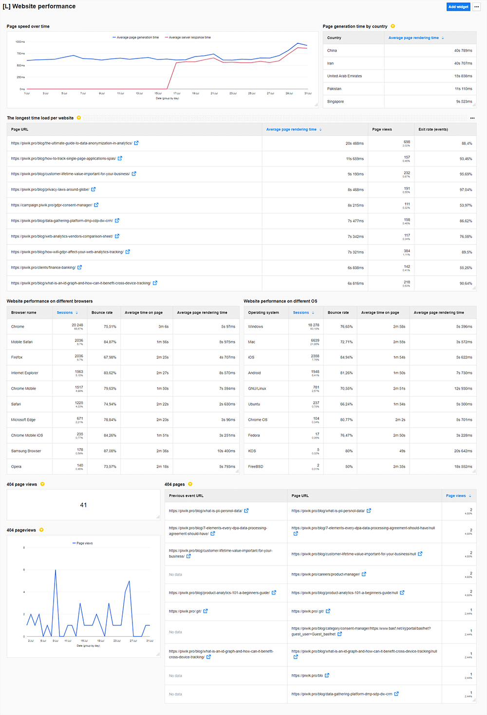
Website performance
Uncover and address technical issues on your site that might ruin the user experience. Find out which pages take too long to load and how different browsers and operating systems impact the page rendering time. Find and fix 404 Page errors.
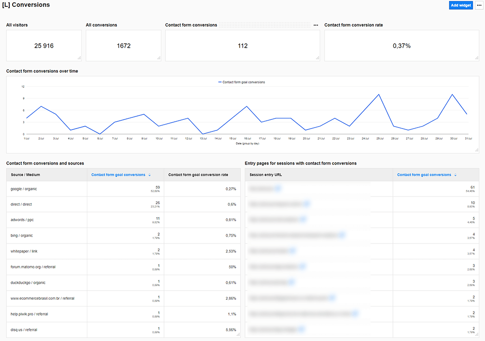
Conversions dashboard
Take a quick look at all conversions gathered in one place. Check how many you can report on and what the rate is. Learn which sources and entry pages work the best and bring users to your site.
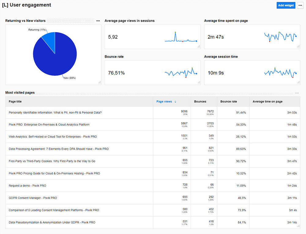
User engagement
Get to know all the core metrics that tell you how visitors interact with your site and whether they find it attractive or not. Learn about the percentage of returning visitors, average time spent on a page, and additional metrics regarding the most visited pages.
Conclusion
As you can see, creating analytics dashboards in Piwik PRO is technically easy, but the hardest part comes in selecting the right data. On top of that, you should design reports with the particular reader in mind so they will get the most out of them.
Well-thought-out dashboards let you simplify data into manageable pieces, enabling you to identify what you are doing right and what needs tweaks and improvements.
We hope that you find this post helpful in your reporting strategy. However, if you would like to get more information on this subject, reach out to our experts and they will be glad to help you.